The Color-Field Romantic
You walk in for a painting and leave with a temperature.
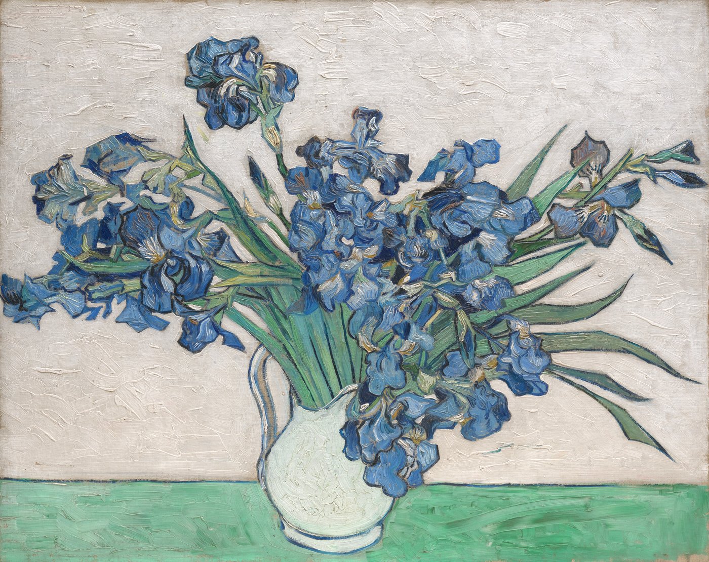
You enter the gallery like someone stepping into weather, and the first thing you notice is not an image but a hue: the warmth coming off a wall, the bleached pink of a 1960s canvas, the way a flat green seems to hum. You prefer rooms that love color — luminous abstraction, open sight lines, works scaled generously to the body — and you will choose light that lets paint breathe over light that tidies it. You move quickly and then stop completely; your path is a series of impulses, a small wander followed by a long, absorbed halt.
You may walk up to a color field and back away at intervals, testing what the color does at different distances. You do not need a narrative when the surface itself is an event. What you leave with is often bodily: a lingering glow, a calm or restless feeling linked to a particular red, a memory of how one rectangle leaned against another. Friends describe your looking as instinctive and alive, as though you were listening to weather. A sample museum day might begin with a room of bright post-painterly canvases, drift past a strong 19th-century park scene, rest the eyes in a cool grey stairwell, and end with a whole floor of immersive color, leaving just before closing when the light in the room seems to go soft amber.
On Light and Shadow, you are near the brighter end but not committed to it; you like a room that glows rather than one that glowers. On order, you lean toward spontaneity — you want the room to encourage free association, not to regiment your pace. On solitude, you are social-ish: you enjoy a friend beside you with whom you can say simply, "that one," without a lecture. On the classical side, you are firmly to the avant-garde end, drawn to the modern freedom of the edge and the unembarrassed flat.
These are preferences in art and space, not predictions; they explain why a color room feels to you like a whole argument made by warmth and repetition rather than by description. You often remember the temperature of a gallery before you remember its contents: a room that felt like late afternoon even at noon, a corridor that turned cool and blue against a warm surrounding wall. You are sensitive to the drift of a hue across a large surface, the way a field of orange at one edge seems to change the white beside it.
When a painting is too busy, you feel it as noise; when it is too timid, you feel it as a missed chance. You want a surface that asks your whole body to look, not merely your reading mind. You may sit on the floor if the benches are against the far wall, because proximity to a large field of color is a kind of climate, and you want to be inside it. You are happy to skip the labels entirely, or read them afterward as a footnote. What you take home is less an interpretation than a lingering sensation, a color you can almost feel on the skin, a quiet wish to live for a while beside that particular green.
Suggested public-domain artwork mood
Curator’s Structural Note
A golden-ratio interval between large forms and a color temperature around 3000–4000 K can act as a secular looking aid, tuning the room to the sensation you came for. Attention Restoration Theory (Kaplan 1995) lends language for "soft fascination" and gentle "compatibility" in rooms that let the eye roam; this is descriptive, not clinical. Keep the warmth as an aesthetic, not a prescription.